Best Practices for WooCommerce Product Page Design
5th March 2025

A well-designed product page can make the difference between a browser and a buyer. It’s one of the most important parts of any e-commerce site and yet, it’s often treated as an afterthought. If your WooCommerce product page design isn’t pulling its weight, you’re missing out on conversions. Whether you’re launching a new online store or refreshing your existing setup, working with a WooCommerce Agency can help you avoid common pitfalls and make your product pages work harder for your business.
Priority Pixels has helped brands across the UK create intuitive, user-focused WooCommerce experiences. There’s no secret formula, but there are tried and tested best practices. And no, they don’t involve stuffing in every possible feature and hoping something sticks.
Let’s take a look at what actually works.
Keep it clean and clear
Cluttered product pages are a conversion killer. If users land on a page that looks like it’s trying to win a design competition from 2004, they’ll likely leave quicker than you can say “add to cart.”
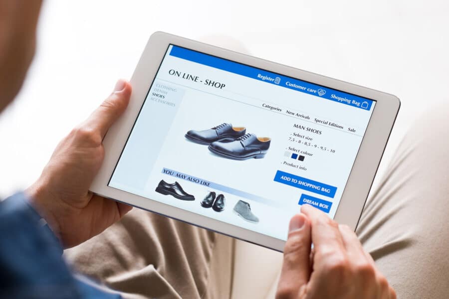
Focus on clarity. Start with a clear hierarchy: product name, price and call-to-action should sit front and centre. Supporting details, specifications and images should follow naturally beneath or beside the main content – not squeezed into sidebars or hidden behind endless tabs. The add-to-cart button should stand out, not play hide and seek.
And if you’re considering adding five different trust badges, three countdown timers and a carousel of animated GIFs… maybe take a step back.
Craft content that actually sells
A product page isn’t just about listing features – it’s about persuasion.
Great photos help. So do videos. But words matter too. Your copy should be concise, helpful and written in plain English. Avoid jargon, fluff and anything that feels like it was copied from a supplier’s spreadsheet.
Talk about benefits, not just features. What does the product do for the customer? Why should they buy it from you? If it solves a problem or makes life easier, say so. If there’s a common question or concern, address it.
And yes, bullet points are great – just don’t forget the power of a well-written sentence.
Build trust at every step
Trust is the foundation of every online purchase. If someone doubts your product or your site, they won’t stick around.
Include star ratings, customer reviews and real testimonials where possible. Make your returns policy easy to find and spell out key delivery info without expecting users to dig through your FAQ page.
If you’ve got third-party endorsements or media mentions, now’s the time to show them off. And don’t underestimate the impact of a simple, secure checkout. If you’re looking to streamline that side of things, we’ve covered the benefits of a WooCommerce one-page checkout in more detail over on our blog.
Prioritise mobile users
More people are shopping on their phones than ever before. That means your product pages need to load quickly, look sharp and work flawlessly on smaller screens.
Design for thumbs, not mouse clicks. Buttons should be easy to tap, text should be readable without zooming and forms should be quick and painless to complete. If something works perfectly on desktop but turns into a jumbled mess on mobile, it’s time for a rethink.

Remove distractions, not confidence
Popups, flashy animations and intrusive upsells can be tempting, but they often do more harm than good. If something interrupts the buying process or slows the page down, it needs to earn its place.
Keep your messaging focused. Use prompts and calls-to-action that guide the user, not distract them. The aim is to keep momentum moving forwards – not send people off on a wild goose chase around your site.
Final thoughts
WooCommerce product page design isn’t just about looking nice, it’s about doing a job. The best pages balance design and content to guide customers from interest to action without friction. That means clear layouts, strong visuals, helpful copy and an experience that builds trust with every scroll.
Priority Pixels works with businesses across the UK to design and develop bespoke WordPress and WooCommerce websites that convert. So if your product pages aren’t quite doing the job, or you’re planning a full website refresh, we’re here to help make sure your site works as hard as you do.
Because great design doesn’t just look good – it gets results.
FAQs
What makes a good WooCommerce product page design?
A good product page is clear, easy to navigate and designed with the user in mind. It should include high-quality images, compelling product descriptions, trust signals like reviews and a prominent call-to-action to encourage purchases.
Should product pages be designed differently for mobile users?
Yes. Since many users browse and buy on their phones, your product pages must be mobile-friendly. That means fast loading times, large tappable buttons and content that’s easy to read on smaller screens.
How do I increase trust on my WooCommerce product pages?
Add customer reviews, clear delivery and returns information and secure checkout icons. Trust builds confidence and helps turn hesitant visitors into confident buyers.