Request a Proposal
Proud to work with
Driving SEO Success for Subframes UK
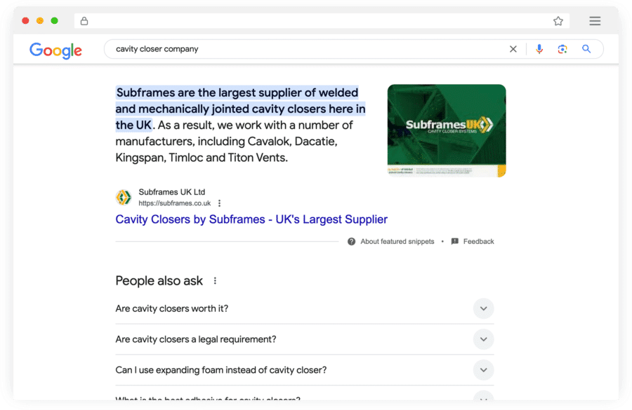
A strong online presence is essential for companies operating in competitive industries like construction and manufacturing. Our SEO strategy for Subframes UK was designed to boost their visibility, drive organic traffic and position them as the go-to provider of cavity closers in the UK.
Ranking #1 for Key Industry Terms
Through in-depth keyword research and content optimisation, we helped Subframes UK secure top rankings on Google for high-intent search terms, including:
- cavity closer company – Ranked #1, ensuring they appear at the top when businesses search for a reliable cavity closer supplier.
- cavity closer manufacturer – Ranked #1, reinforcing their authority in the market.
- cavity closer supplier – Ranked #1, positioning them as the first choice for commercial and residential builders.
-
Creative Web Design & SEO Services
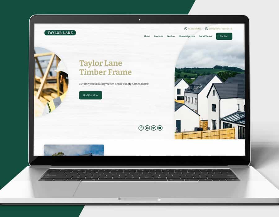
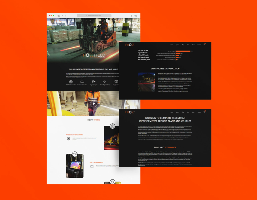
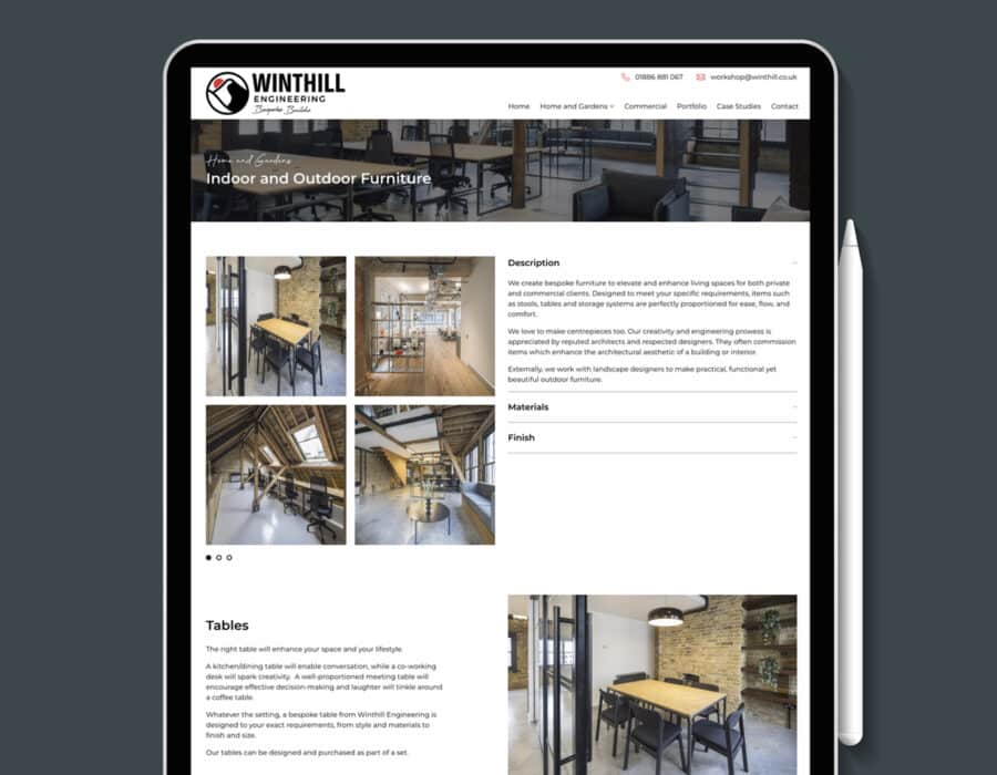
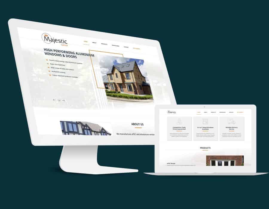
Creative web design for construction businesses
Web design is not just about how a site looks and feels. It is also about how it works behind the scenes and ensuring it is built to achieve your marketing goals. Whether its the structure of your sitemap which makes your pages easy to find or its a clear user friendly layout or whether is has lead generation capabilities Priority Pixels has you covered. We have successfully established a tried and tested web design process that makes sure every site we produce delivers its core aim.
SEO tailored to the construction industry
A solid SEO strategy combines technical optimisation, content optimisation and authority optimisation. At Priority Pixels we have practitioners in each of these, ensuring your website ranks well in the SERPs and drives traffic to your website.
Lead generation to help grow your construction business
PPC is always changing. Consumer intent, the landscape, technology and platforms continue to evolve. Priority Pixels have the right people, technology and approach to ensure your paid search activity is at the forefront of digital innovation.
-
Construction Website Design
Priority Pixels are a highly professional and experienced web design team based in Newton Abbot. We have many years of experience not only in Construction website design, but in marketing and IT meaning we can not only design you a great Construction website but also promote, support and maintain it once it’s online.
At Priority Pixels we put a lot of emphasis on customer service. We understand how difficult it is to find a Construction website designer that wants to do anything but code. We ensure all our clients get a dedicated Project Manager who is available by email, phone and even face to face.
WordPress Web design
Priority Pixels specialise in designing and building WordPress websites, including Construction websites. We have been working with WordPress since it began in 2003, so there isn’t much we don’t know about it. WordPress is a content management system and we use it to give our clients the ability to easily add and update their websites content.
User Interface Design
User Interface Design (UI) is critical to the success of your Construction website. By creating attractive and intuitive designs, our websites are easy to use and work across mobile and desktop devices. The easier your website is to use, the happier your customers will be.
Search Engine Optimisation
Making sure that your Construction website has useful and valuable content on its pages is key to its success. For your organic searches to rise, your website needs to meet certain requirements of the biggest and most dynamic search engines. Our experience and knowledge in Search Engine Optimisation have allowed us to help design Construction websites that deliver results.
Website Maintenance and Security
We offer maintenance and security services for Construction websites. If you are a Construction company that doesn’t have enough time to manage your website, we can do it for you. We take data seriously. Our security services ensure that your Construction website is as secure as possible and your customers’ data is safe.
-
Responsive Construction Website Design
You may be wondering “What is responsive web design?” These days websites aren’t just accessed via computers. It is increasingly common for more than 50% of website visitors to use smartphones. With this in mind it’s important that your Construction website is designed to work on smartphones, tablets and desktop computers. Not only does this make your website more accessible to your users but it helps your customers know you take your website seriously.
In April 2018 Google announced mobile-first indexing. Simply put, this means the mobile version of your website is the version that Google will include in its index first. If you do not have a responsive Construction website design, Google will still index the desktop version of your site. However the lack of a mobile friendly website design could have a negative impact on your search engine rankings. All of our Construction website designs are responsive, ensuring that your website gets the best chance possible in the search engines.
-
Managed Construction Website Hosting
All Construction websites require hosting to work, but the quality of website hosting varies hugely. You may be tempted by the cheap hosting advertised on the TV or online, declaring deals as low as hosting for £1 a month. If you value your Construction website and your business, please avoid these ‘cheap’ options at all costs.
Good website hosting is worth its weight in gold. It is vital that your website loads quickly, ensuring your visitors get the best experience possible. If your website takes too long to load they’ll quickly hit the back button and try a different website.
At Priority Pixels we only use the best website hosting to ensure that our clients’ Construction websites are not only online, but run as quickly and efficiently as possible. We offer scalable cloud hosting to ensure your website remains online 24 hours a day, 365 days a year.
We also offer daily backups of your Construction website files and databases, keeping them safe and secure should the situation arise where you need to restore anything. We can even migrate your existing website for free, if you are unhappy with your current service provider.
FAQs
I’m looking for the best construction website design agency, can you help?
Yes we certainly can help. We have clients across a wide range of industries and locations, but have experience creating responsive Construction website designs. We are happy to work by email, phone, or face to face, whatever works best for you.
I don’t like my current construction website designer/developer, can I switch to Priority Pixels?
If you aren’t happy with the quality of service you are receiving from your current web designers/developers, then we are more than happy to help out. We have a number of clients that move from other web designers and agencies to us, because they feel they aren’t getting the service they deserve. We can even help transfer your domains and hosting to us. Customer service is very important to us here at Priority Pixels, so if you are thinking of moving your website elsewhere please have a chat with us first to see how we can help. We offer a professional service and some of the best web design has to offer.
If you would like to read some of our reviews please check our Google My Business and Trustpilot pages.
How much does a construction website design cost?
The cost of a Construction website design is determined by many factors. Websites range in style and size. You may only need a simple website with a few pages to showcase your services. Or, you may require a more complex e-commerce website with the ability to sell and hire out plant equipment. The amount of designing you need can also impact on costs. It is always best to create a wish list or a brief so that we can give you accurate costs.
What is website hosting?
Website hosting allows individuals and businesses to display their websites on the Internet. Websites are made up of various files containing the code and databases needed to display the website correctly on a users browser. These files are stored on computers called servers. Servers are kept on 24 hours a day, 365 days a year to ensure your website always remains online. We offer a quality web hosting service, which will keep your website, not only live, but as safe and secure as possible.
What is a domain name?
Your computer connects to a website’s server via an IP address, which is a long string of numbers. A domain name is a friendly version of this IP address, so that users can easily remember and identify a website. You need both a domain name and hosting for your website to work.
My construction website has been hacked, can you help?
If the security of your construction website has been compromised, the team at Priority Pixels can help. Our team of expert website designers boast extensive technical knowledge and skills. We don’t simply create websites – we understand how they’re put together, from the server where your site is stored to the front end your visitors see.
If your website has been hacked, please contact the team at Priority Pixels as soon as possible. We can carry out a thorough assessment and advise you on the steps you need to take.
What CMS do you build your websites on?
We build all of our websites on the WordPress open-source Content Management System (CMS). We use the Advanced Custom Fields plugin to tailor the back end of the website, ensuring all of our clients can edit their own content with ease. No HTML knowledge required!
If I ask for a quote, what happens next?
We will usually arrange a phone call or if you are based locally to our office in Newton Abbot, a meeting to get things started. From this initial discussion we can find out more about your business, your audience and your marketing goals. From this, we will put forward our recommendations, from information gathered and if you’re happy with what we’ve said, we can put together a project proposal and move forward from there.


