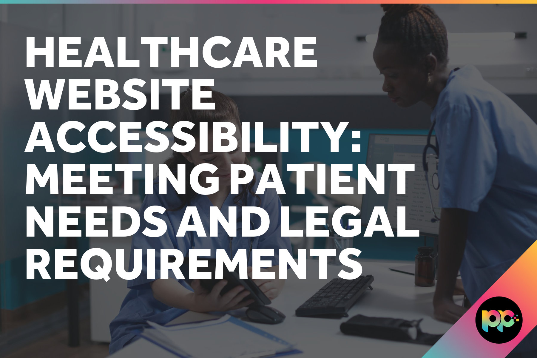
Why is Colour Contrast Important for Accessibility?
Colour shapes first impressions like nothing else in web design. You choose your palette carefully, spend hours perfecting the visual hierarchy and create something that looks stunning on your screen. But here’s the problem: what looks brilliant to you might be completely invisible to someone else. As a website accessibility team, we see this constantly. Without proper colour contrast, your carefully crafted design can exclude users and limit engagement across your entire site.
Poor contrast doesn’t just affect users with visual impairments. Bright office lighting, mobile screens in sunlight or tired eyes at the end of a long day can make low-contrast text nearly unreadable for anyone. Colour contrast sits right at the foundation of inclusive design and getting the basics right makes everything else easier.
What Colour Contrast Actually Means
![]()
Colour contrast measures the difference in luminance between two colours. Luminance determines how much light a colour reflects back to your eyes, which makes it appear bright or dark. The bigger the difference between two colours, the easier they are to distinguish.
We measure this using contrast ratios. Black text on white background gives you the maximum possible ratio of 21:1. Those colours couldn’t be more different. But drop some light grey text onto a pale background and you might end up with a ratio closer to 1:1. At that point, the text becomes virtually invisible to many users.
Think about it this way: if you’re squinting to read something on a screen, the contrast probably isn’t working. Now imagine trying to navigate that same content with a visual impairment, in poor lighting or on a device with limited screen quality.
Meeting WCAG Standards for Contrast
The Web Content Accessibility Guidelines (WCAG) 2.2 set clear standards for colour contrast. Normal text needs a minimum contrast ratio of 4.5:1 to meet AA compliance. This isn’t arbitrary. It’s based on extensive research into what makes text readable for the widest range of users.
WCAG contrast requirements ensure text remains readable for users with moderately low vision, typically equivalent to 20/40 vision or worse.
Large text gets a bit more flexibility. If your text is 18pt or larger (or 14pt and bold), you only need to hit 3:1. Bigger text is naturally easier to read, so the contrast requirement drops slightly.
Some elements are exempt from these rules:
- Decorative text that doesn’t convey information is exempt from contrast rules.
- Inactive interface elements like disabled buttons do not need to meet the minimum ratio.
- Text within logos where brand recognition takes priority falls outside the requirements.
- Incidental text that’s not meant to be read, such as placeholder content, is also excluded.
For public sector organisations especially, meeting these standards isn’t optional. The Public Sector Bodies Accessibility Regulations require WCAG AA compliance across all digital services. NHS trusts, councils and government departments all need to demonstrate their websites work for everyone.
| Text Type | Minimum Contrast Ratio | WCAG Level |
|---|---|---|
| Normal text | 4.5:1 | AA |
| Large text (18pt+) | 3:1 | AA |
| Normal text (enhanced) | 7:1 | AAA |
| Large text (enhanced) | 4.5:1 | AAA |
Testing contrast ratios is straightforward. The WebAIM Contrast Checker lets you input any colour combination and see whether it meets WCAG standards. Browser developer tools also include accessibility panels that flag contrast issues automatically.
Designing with Contrast in Mind
![]()
Good contrast design goes far beyond just making text readable. You need to think about every element that communicates information or requires user interaction.
Red text might signal an error to you, but it’s meaningless to someone who can’t distinguish red from green. Always pair colour with additional indicators like icons, text labels or visual patterns. Form validation is a perfect example. Show a red border and an error message, not just one or the other.
That pale grey text might look sophisticated on your studio monitor, but try reading it on a phone screen outside or on a laptop in a bright meeting room. Colours behave differently under various lighting conditions and across different devices. What works in controlled conditions might fail in the real world.
Buttons, links and form fields must stand out clearly from their backgrounds. If users can’t identify clickable elements, they can’t navigate your site effectively. This is particularly important for web design that prioritises conversion. Poor contrast on call-to-action buttons directly impacts business outcomes.
Focus states deserve special attention. When someone navigates using a keyboard, they need clear visual indicators showing which element currently has focus. Many designers style these with subtle outlines that don’t meet contrast requirements, making keyboard navigation nearly impossible.
Mixed contrast levels create confusion and signal poor attention to detail. If your main navigation meets WCAG standards but your footer links don’t, users will struggle to maintain engagement across different sections of your site.
Consistent contrast standards across all site elements create predictable, trustworthy user experiences that work for everyone.
Beyond Basic Compliance
Meeting WCAG AA standards is the baseline, not the finish line. Many organisations target AAA compliance where possible, particularly for critical content or primary user journeys. The enhanced contrast requirements (7:1 for normal text, 4.5:1 for large text) provide better accessibility for users with more significant visual impairments.
Consider your audience carefully. Healthcare websites serving elderly patients might benefit from higher contrast ratios across all text. B2B platforms used in various office environments should account for poor lighting conditions and screen glare. Ecommerce sites need to ensure product information and pricing remain clearly visible under any circumstances.
The rise of dark mode adds another layer of complexity. Many users prefer dark interfaces, especially in low-light conditions, but not all colour schemes work effectively when inverted. WordPress development often involves creating flexible colour systems that maintain proper contrast across both light and dark themes.
Modern CSS custom properties make this much easier to manage. Rather than hard-coding colours, you can define contrast-aware colour systems that adapt automatically based on user preferences or system settings.
Making Accessibility Standard Practice
![]()
Colour contrast forms just one part of broader web accessibility, but it’s often the most visible indicator of whether accessibility was considered during design and development. Poor contrast suggests broader accessibility issues likely exist elsewhere.
At Priority Pixels, accessibility considerations shape every project from initial wireframes through to final deployment. Our web development process includes automated contrast checking, manual testing across different devices and environments and validation against WCAG standards before any site goes live.
Accessibility isn’t about compliance. It’s about creating digital experiences that work for the widest possible audience while delivering better outcomes for your organisation.
Getting contrast right from the start costs nothing extra but provides immediate benefits. Better readability improves user engagement, reduces bounce rates and supports SEO performance. For public sector organisations, it demonstrates commitment to inclusive service delivery. For B2B companies, it signals attention to detail and professional competence.
If you’re unsure about your current site’s accessibility standards, a professional accessibility audit can identify issues and provide clear recommendations for improvement. The cost of fixing accessibility problems after launch far exceeds the investment required to build inclusively from the beginning.
Colour contrast might seem like a small detail, but it’s foundational to creating websites that truly work for everyone. Get this right and you’re well on your way to delivering digital experiences that are both beautiful and fully accessible.
FAQs
What contrast ratio do I need for my website to meet accessibility standards?
Normal text requires a minimum contrast ratio of 4.5:1 to meet WCAG AA standards, whilst large text (18pt or bigger) only needs 3:1. For AAA compliance, these requirements increase to 7:1 and 4.5:1 respectively. You can test any colour combination using tools like the WebAIM Contrast Checker.
Does poor colour contrast only affect users with visual impairments?
No, poor contrast affects everyone in certain situations. Bright office lighting, mobile screens in direct sunlight, tired eyes or lower-quality displays can make low-contrast text difficult to read for any user. Good contrast benefits all users, not just those with visual impairments.
How should I design error messages and form validation to be accessible?
Never rely on colour alone to communicate errors or important information. Always combine colour indicators with text labels, icons or visual patterns. For example, show both a red border and an error message, rather than just changing the colour of a form field.
Co-Founder at Priority Pixels
Paul leads on development and technical SEO at Priority Pixels, bringing over 20 years of experience in web and IT. He specialises in building fast, scalable WordPress websites and shaping SEO strategies that deliver long-term results. He’s also a driving force behind the agency’s push into accessibility and AI-driven optimisation.